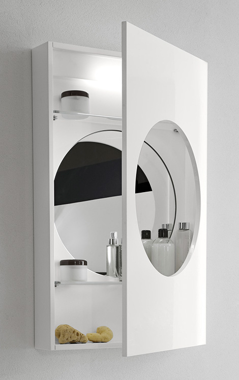
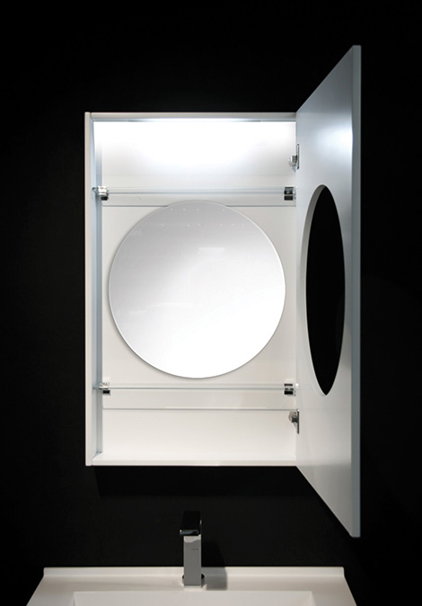
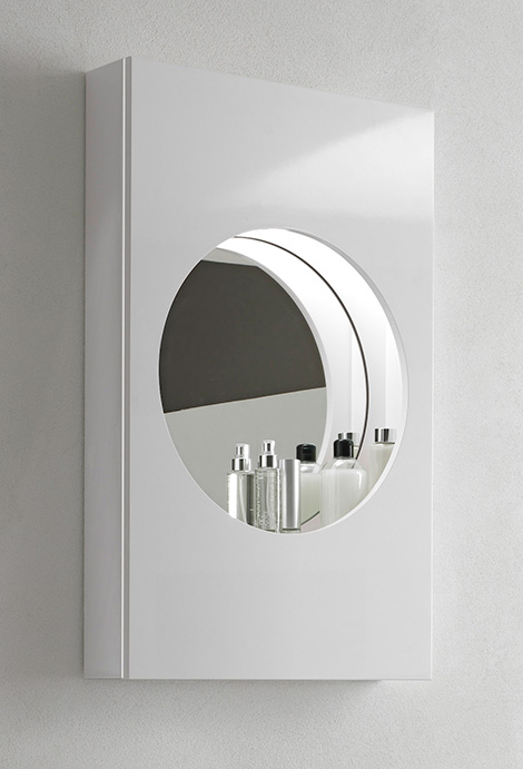
Mirror, mirror on the wall, who is the fairest of them all? Well, in our opinion it’s the new Marathi mirror cabinet by Hastings. This illuminated bathroom mirror cabinet fulfils so many functions while adding a simple but stunning focal point. The cabinet door is cut in the center to reveal a circular window for the mirror. Swing open the door and there are two glass shelves for all your daily essentials, out of sight but within easy reach. Whether contemporary or traditional, large or small, this mirror’s minimalist design will suit every space. And we love this ultra-modern twist – integrated illumination! Once you try shaving or applying make-up with this mirror, you’ll wonder how you ever survived without it! Check it out at Hastings.
Thứ Bảy, 18 tháng 9, 2010
Bathroom Illuminated Mirror Cabinet
Mirror, mirror on the wall, who is the fairest of them all? Well, in our opinion it’s the new Marathi mirror cabinet by Hastings. This illuminated bathroom mirror cabinet fulfils so many functions while adding a simple but stunning focal point. The cabinet door is cut in the center to reveal a circular window for the mirror. Swing open the door and there are two glass shelves for all your daily essentials, out of sight but within easy reach. Whether contemporary or traditional, large or small, this mirror’s minimalist design will suit every space. And we love this ultra-modern twist – integrated illumination! Once you try shaving or applying make-up with this mirror, you’ll wonder how you ever survived without it! Check it out at Hastings.
Thứ Năm, 16 tháng 9, 2010
Maison Saad / Mila Strauss Arquitetura
Mila Strauss Arquitetura
Location: Brasilia, Brazil
Project Team: Mila Strauss, Luiza Soares de Camargo
Client: Maison Saad
Constructed Area: 300 sqm
Project year: 2009
Photographs: Marri Nogueira
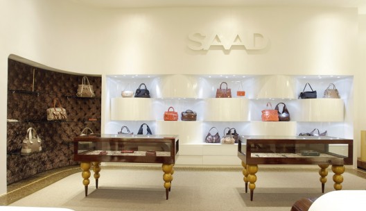
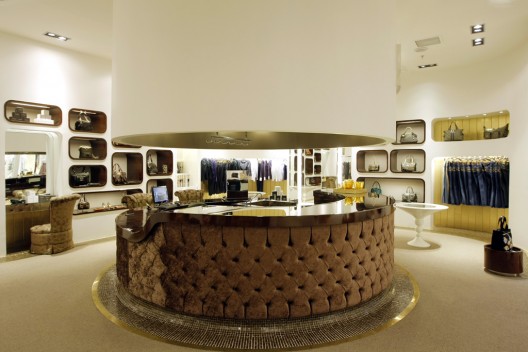
The idea of the project was to create a sophisticated atmosphere through contemporary and classical architectural elements that reflect the articulation of generations that characterize Saad.
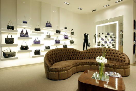
The concept adopted for the development of the store was inspired by the artisan of the articles of the brand and integrates smoothly curved lines, the use of leather and gold trim white lacquer:
The wavy lines bring movement and light, blending into the brown, reminiscent of pure leather.
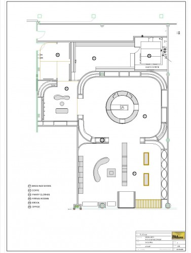
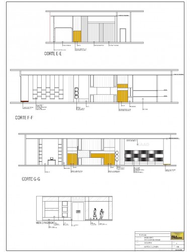
The space is wide and its layout of 300 sqm was divided into four parts: Bags, party clothes, comfortable fitting rooms and a cafe.
To keep a very high standard, we have a low value sqm and refined solutions that express the concept of the brand and create the basis for product display.
The concept of the stores started in august 2008. The first that was built was in Rio de Janeiro, then Curitiba and then Brasilia.
The idea is to build stores in other important cities in Brasil
Architect:
Location: Brasilia, Brazil
Project Team: Mila Strauss, Luiza Soares de Camargo
Client: Maison Saad
Constructed Area: 300 sqm
Project year: 2009
Photographs: Marri Nogueira
The idea of the project was to create a sophisticated atmosphere through contemporary and classical architectural elements that reflect the articulation of generations that characterize Saad.
The concept adopted for the development of the store was inspired by the artisan of the articles of the brand and integrates smoothly curved lines, the use of leather and gold trim white lacquer:
The wavy lines bring movement and light, blending into the brown, reminiscent of pure leather.
The space is wide and its layout of 300 sqm was divided into four parts: Bags, party clothes, comfortable fitting rooms and a cafe.
To keep a very high standard, we have a low value sqm and refined solutions that express the concept of the brand and create the basis for product display.
The concept of the stores started in august 2008. The first that was built was in Rio de Janeiro, then Curitiba and then Brasilia.
The idea is to build stores in other important cities in Brasil
Thứ Ba, 14 tháng 9, 2010
Cooperative Credit Bank / Studio Kuadra
Studio Kuadra
Location: Fossano, CN, Italy
Project Year: 2006
Photographs: Courtesy of Studio Kuadra
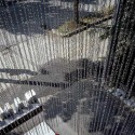
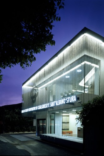
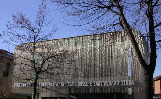
A cascade of chains on the facade, dynamic space, mobile, changing, not what you would expect from a bank, especially in a province at the foot of the Maritime Alps. The branch of this Credit Agency, winner of a closed competition, brings a breath of lightness and a levity that would be more common in a completely different sort of building; an exhibition centre or a performance venue, for example.
This bank is stripped of that entire traditional image which characterises an institution of this type and instead presents a new unedited image of itself.
Surprising and innovative outside, intimate and welcoming inside.
Although made up mainly of young people, the Kuadra studio of architects knows how to obtain the very best from the materials they use with rigor and finesse. Glass, metal and stainless steel are all combined in a clever alchemy that highlights consistency, form, quality and singularity, while never neglecting composition, which remains precise and clean.
The best way to fulfill the needs of the future customers and employees are constantly taken into consideration during the process of the project.
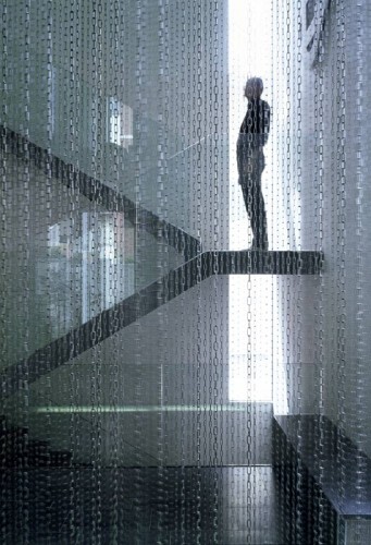
Strips of light, transparent staircases and pathways at different levels mean that clients in this bank will not be limited to cueing at the teller’s counter. They will have an opportunity to experience an architectural quality that Le Corbusier christened Architectural Promenade.
The architecture seems like an ode to clarity, transparency, to conceptual essence itself, while at the same time never losing sight of that direct functional relationship with the public, not just words from a bank worker’s manual, but the real public; an old man, a parent a child, all with differing needs. There is a wide, luminous open informal space given over to a children’s’ play area, quite a novelty in a bank, besides the obligatory comfortable sofas at the entrance. Wherever one goes from the counters to the meeting rooms one is breathing in that atmosphere of ordinary domesticity that never descends into the banal or predictable.
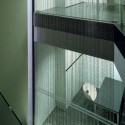
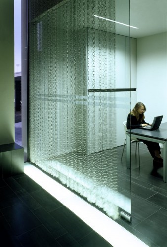
The inclusion of the chains on the façade, 11 linear kilometres, are no mere stylistic or aesthetic pretence, no external second skin. The idea is much more considered. The whole building, changes, shimmers and modifies its physical consistency. The curtain of chains hanging from on high fluctuates lightly letting off a gentle ringing, like Tibetan prayer bells. It captures the light bringing it inside, moulding it, and changing it, thus transforming the massive potentially heavy interior so that the whole building becomes a gigantic semitransparent lamp. In direct sunlight they act as protective sunshades.
Functionality and poetry combined naturally, without being pretentious. The result is surprising.
Architects:
Location: Fossano, CN, Italy
Project Year: 2006
Photographs: Courtesy of Studio Kuadra
A cascade of chains on the facade, dynamic space, mobile, changing, not what you would expect from a bank, especially in a province at the foot of the Maritime Alps. The branch of this Credit Agency, winner of a closed competition, brings a breath of lightness and a levity that would be more common in a completely different sort of building; an exhibition centre or a performance venue, for example.
This bank is stripped of that entire traditional image which characterises an institution of this type and instead presents a new unedited image of itself.
Surprising and innovative outside, intimate and welcoming inside.
Although made up mainly of young people, the Kuadra studio of architects knows how to obtain the very best from the materials they use with rigor and finesse. Glass, metal and stainless steel are all combined in a clever alchemy that highlights consistency, form, quality and singularity, while never neglecting composition, which remains precise and clean.
The best way to fulfill the needs of the future customers and employees are constantly taken into consideration during the process of the project.
Strips of light, transparent staircases and pathways at different levels mean that clients in this bank will not be limited to cueing at the teller’s counter. They will have an opportunity to experience an architectural quality that Le Corbusier christened Architectural Promenade.
The architecture seems like an ode to clarity, transparency, to conceptual essence itself, while at the same time never losing sight of that direct functional relationship with the public, not just words from a bank worker’s manual, but the real public; an old man, a parent a child, all with differing needs. There is a wide, luminous open informal space given over to a children’s’ play area, quite a novelty in a bank, besides the obligatory comfortable sofas at the entrance. Wherever one goes from the counters to the meeting rooms one is breathing in that atmosphere of ordinary domesticity that never descends into the banal or predictable.
The inclusion of the chains on the façade, 11 linear kilometres, are no mere stylistic or aesthetic pretence, no external second skin. The idea is much more considered. The whole building, changes, shimmers and modifies its physical consistency. The curtain of chains hanging from on high fluctuates lightly letting off a gentle ringing, like Tibetan prayer bells. It captures the light bringing it inside, moulding it, and changing it, thus transforming the massive potentially heavy interior so that the whole building becomes a gigantic semitransparent lamp. In direct sunlight they act as protective sunshades.
Functionality and poetry combined naturally, without being pretentious. The result is surprising.
Chủ Nhật, 12 tháng 9, 2010
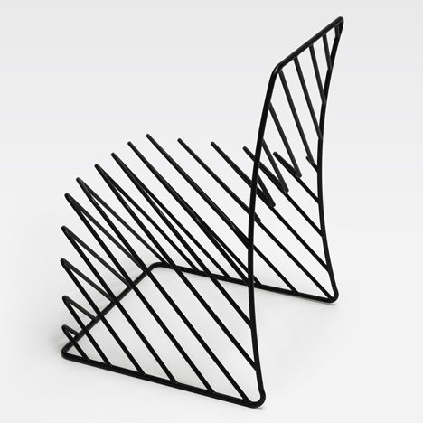
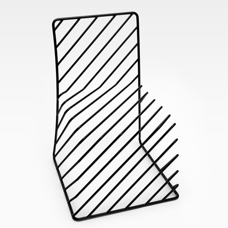
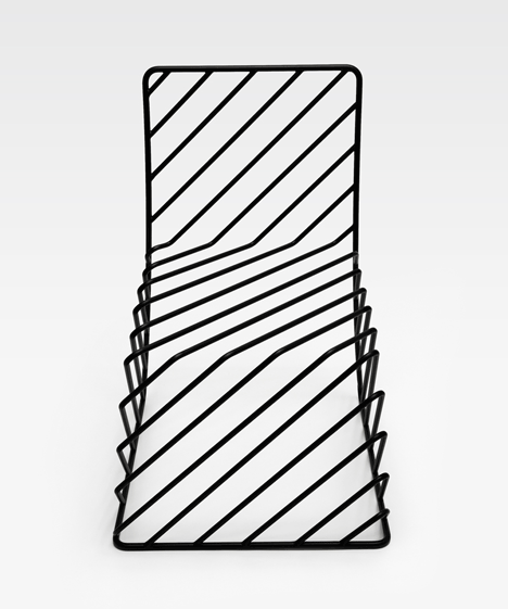
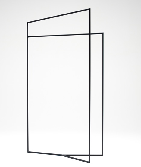
Thin Black Lines by Nendo
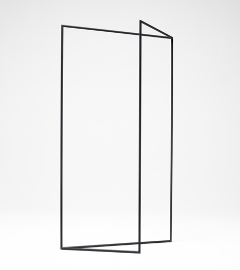
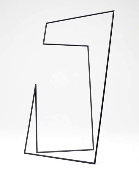
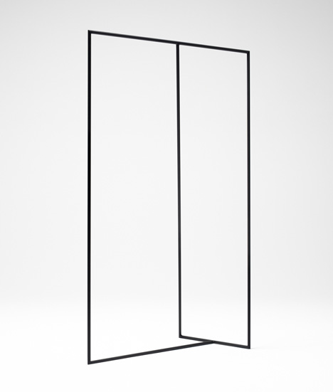
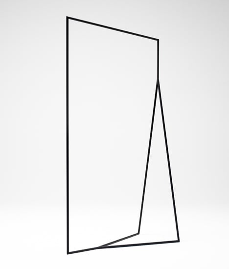
Japanese studio Nendo will present a collection of black wire furniture with Phillips de Pury & Company at the Saatchi Gallery in London later this month.
Called Thin Black Lines, the series includes a chair and clothes rack intended to apear as sketches in the air or calligraphy symbols.
The show opens 20 September – 31 October.
See all our stories about Nendo in our special category.
Photographs are by Masayuki Hayashi.
The information that follows is from Nendo:
Thin Black Lines
‘Outlines were the theme of this collection. Slight black lines like the traces of sketches drawn in the air made transparent surfaces and volumes appear, which we assigned practical functions.
The outlines remained after simplifying paintings of plants and animals. They are condensed expressions of meaning, similar to Japanese calligraphy.
The designs gently break the relationship of before and behind, and traverse at times the space between two and three dimensions. Multi-faceted and constantly morphing, they move alternately between the becoming and collapse of form.
Thứ Sáu, 3 tháng 9, 2010
Home 08 by i29 Interior Architect
.
Description from i29 Interior Architects:
This small apartment in Amsterdam, NL (45 m2) is completely renovated because of foundation repair. In it’s new layout all the functions of the house are placed in two wall units. Entrance hall, wardrobe and kitchen equipment are hidden behind a pinewood wall. On the opposite a second wooden wall of the same material is placed. This wall integrated a bench, fireplace and storage. Floor, ceiling and walls are all white. A custom designed table and bench, together with the fireplace are anthracite gray. The simplicity of the design and choice of materials give this apartment lots of space within the limited area.
Visit the website of i29 Interior Architects – here.
Đăng ký:
Bài đăng (Atom)